
THE CHALLENGE
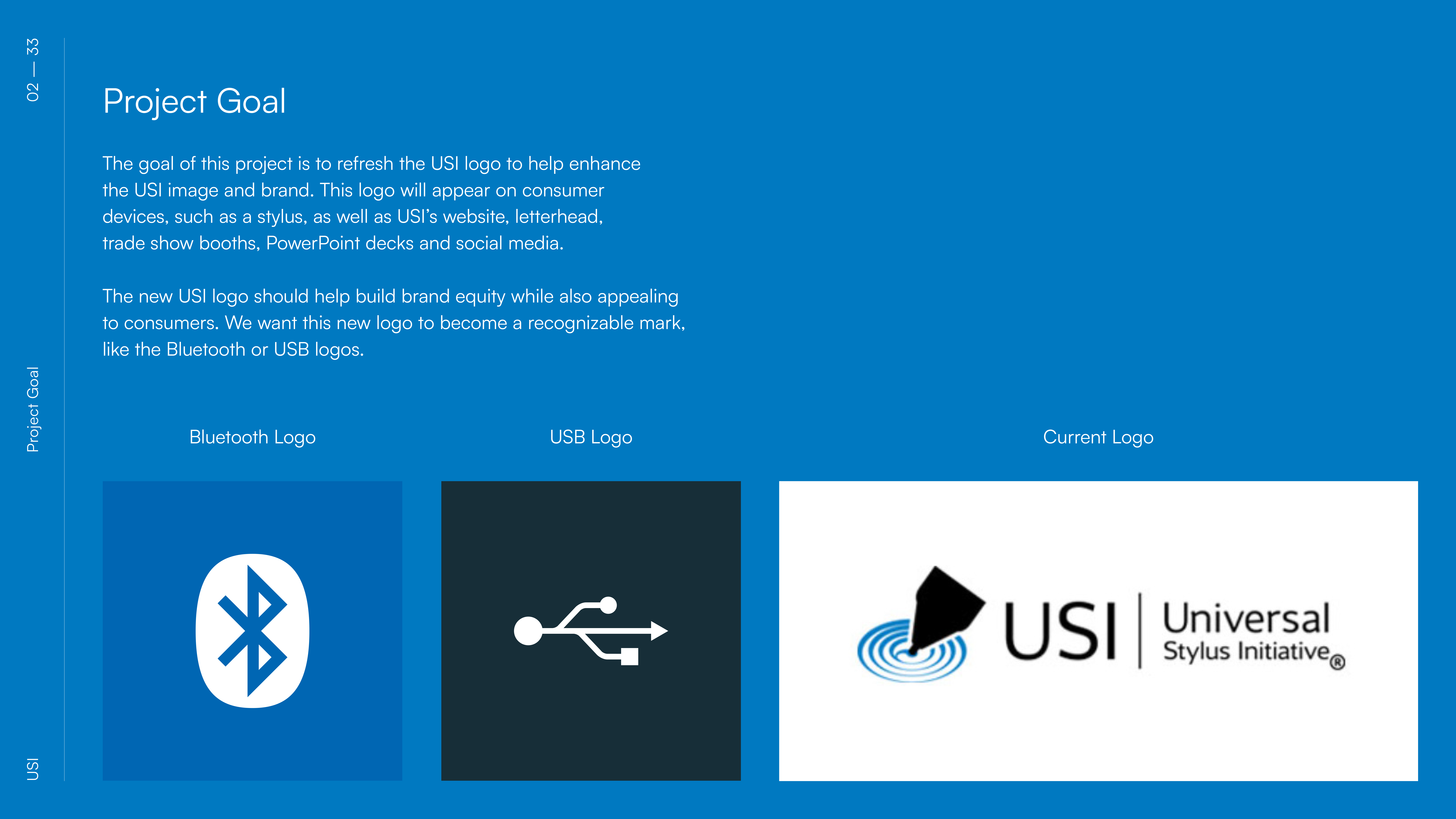
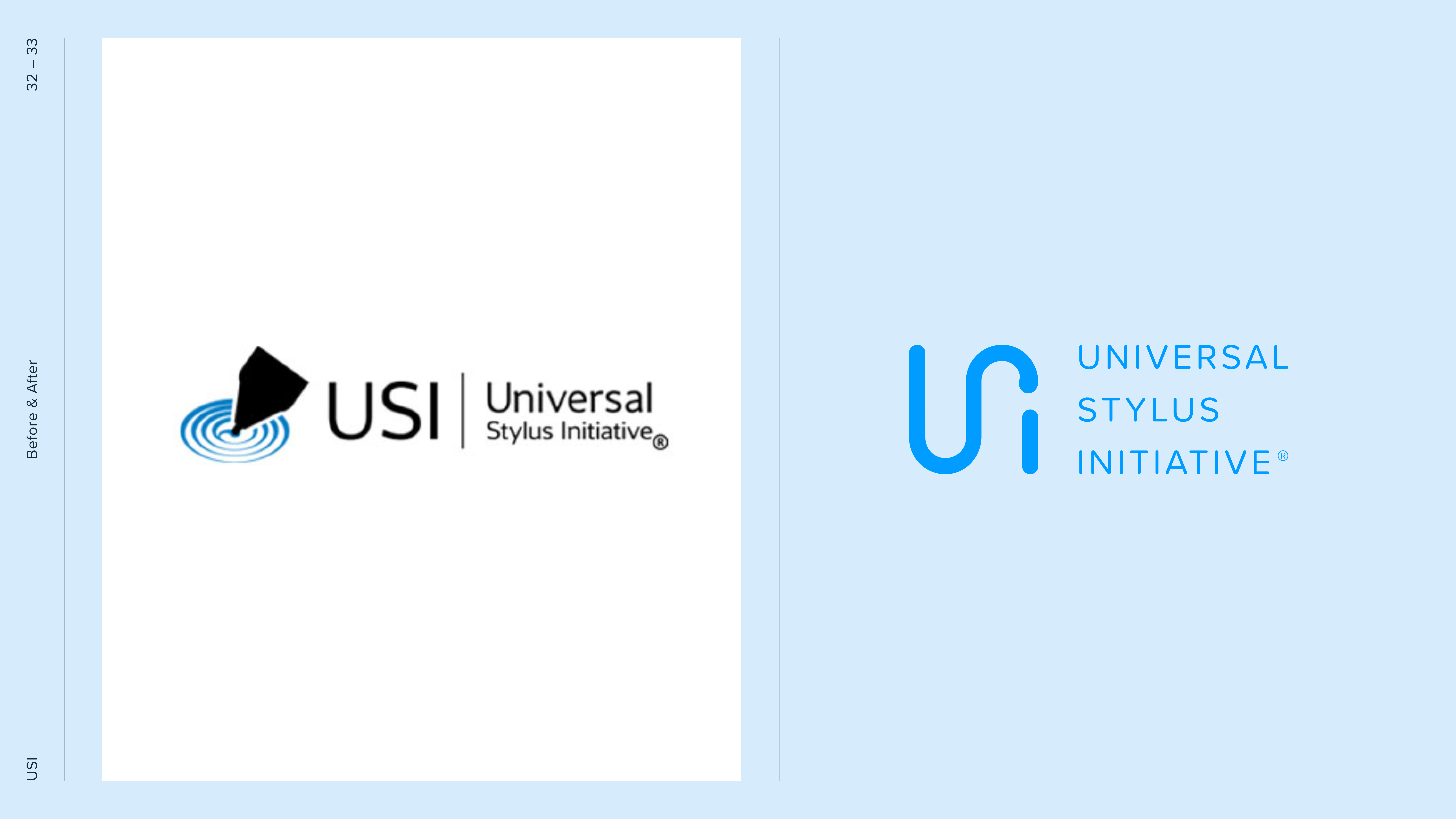
Universal Stylus Initiative was close to walking away from the agency they were working with (inmotion). The brand mark had become a sticking point, disconnected, rigid, and out of sync with the fluid technology it represented.
For a consortium built on collaboration and universal standards, the identity needed to signal trust, clarity, and adaptability. Instead, it created frustration.
The goal was to step in, rescue the relationship, and redesign the mark into something fluid, functional, and future-proof.
MY ROLE
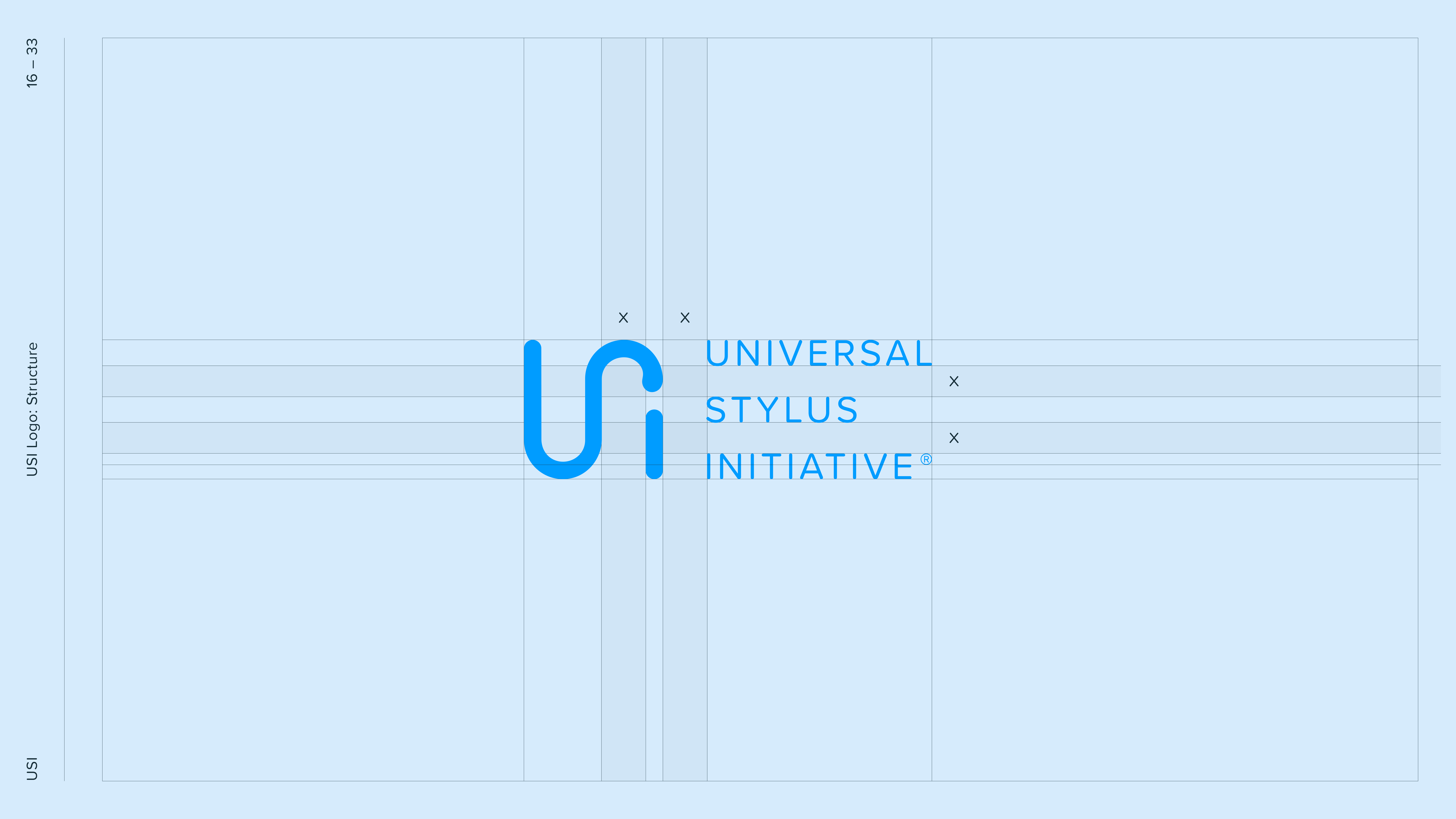
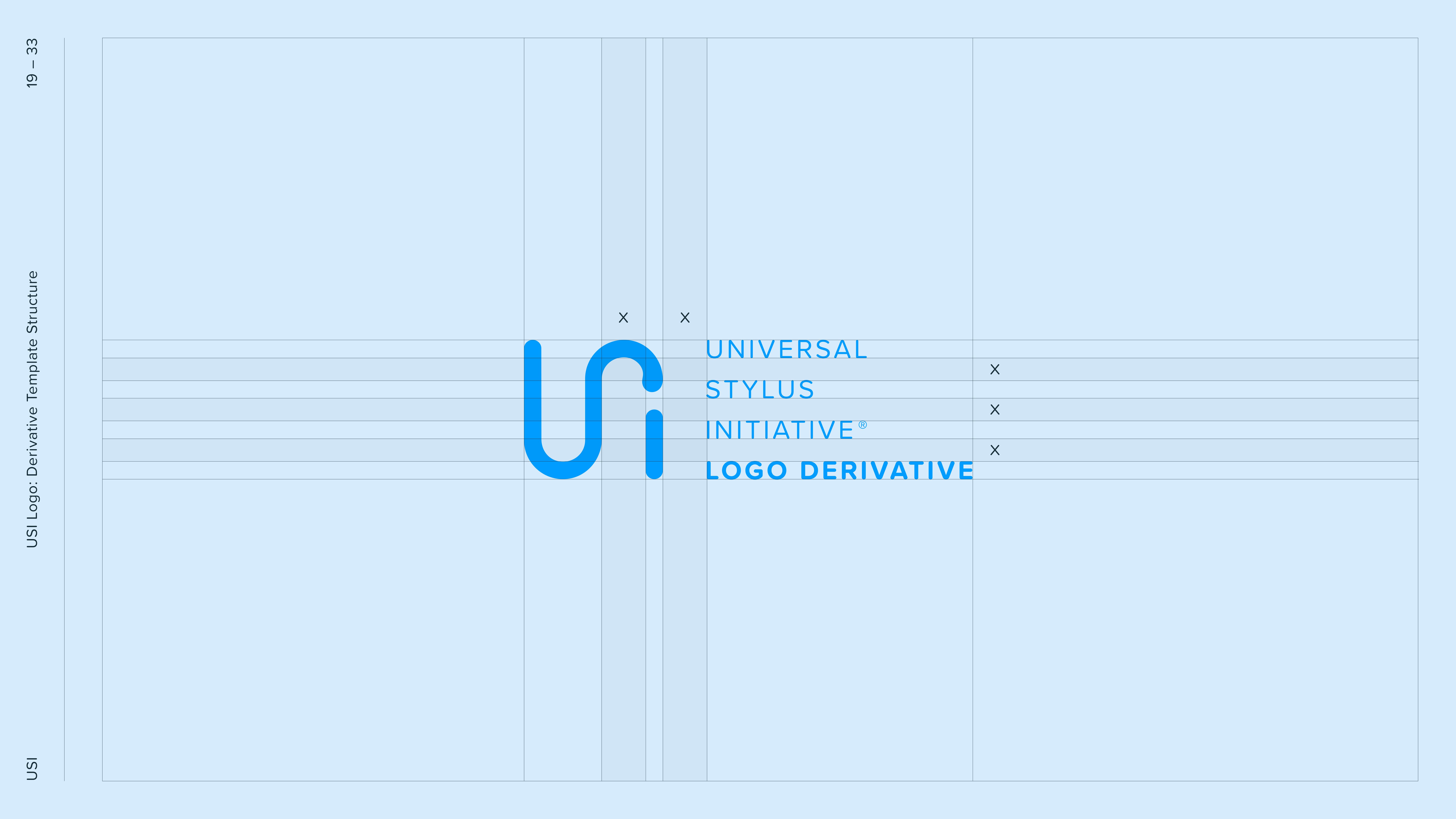
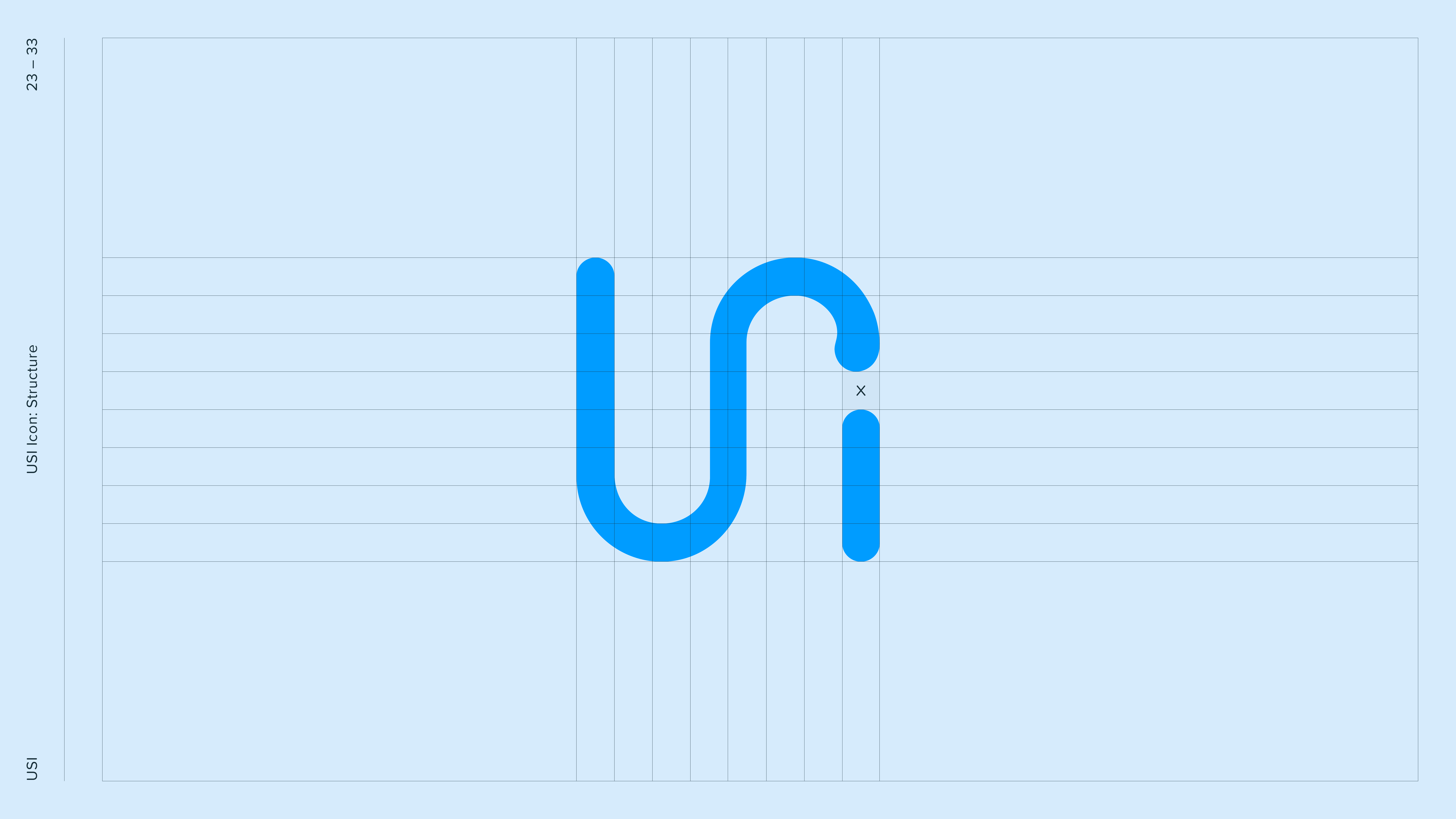
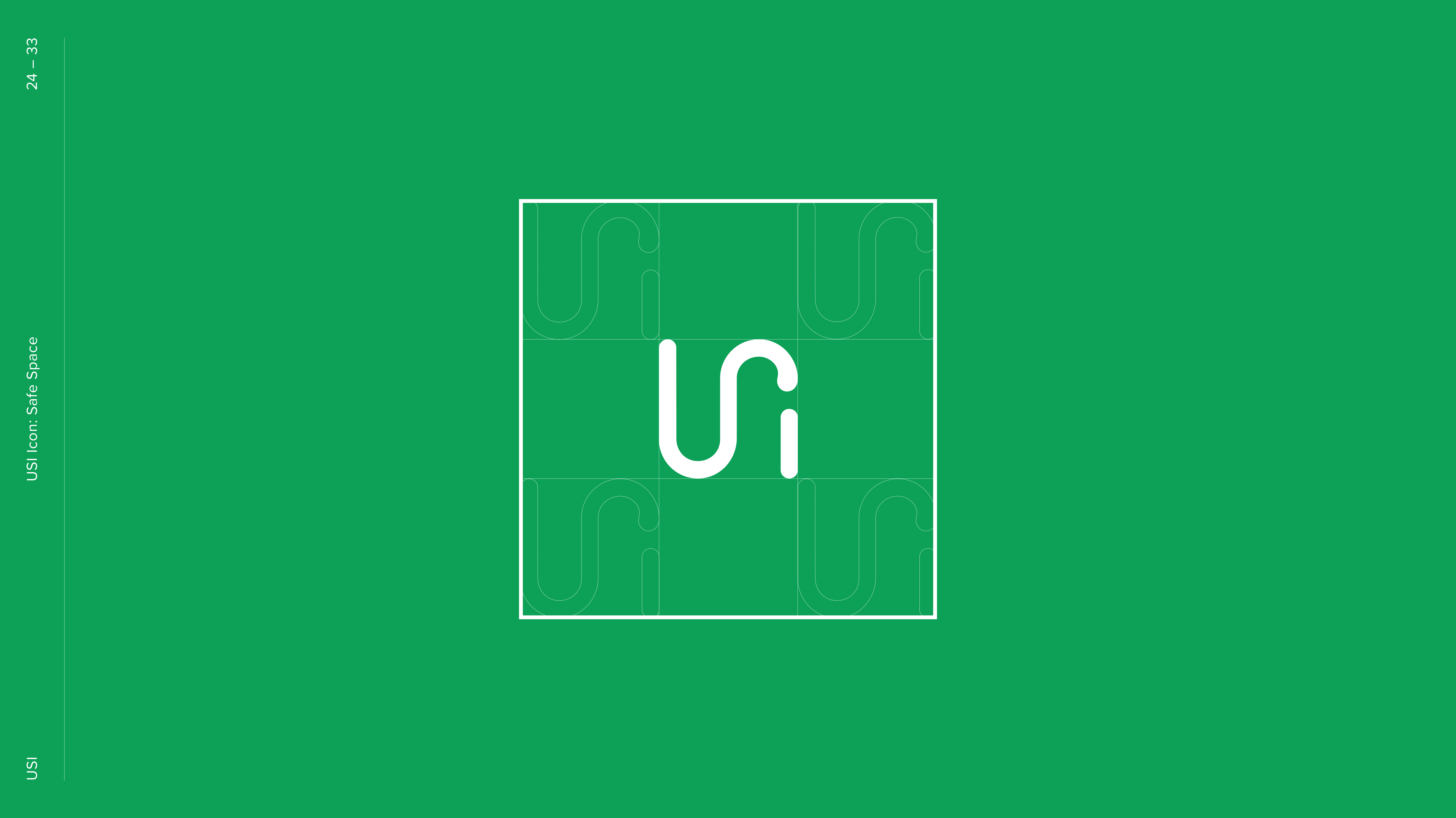
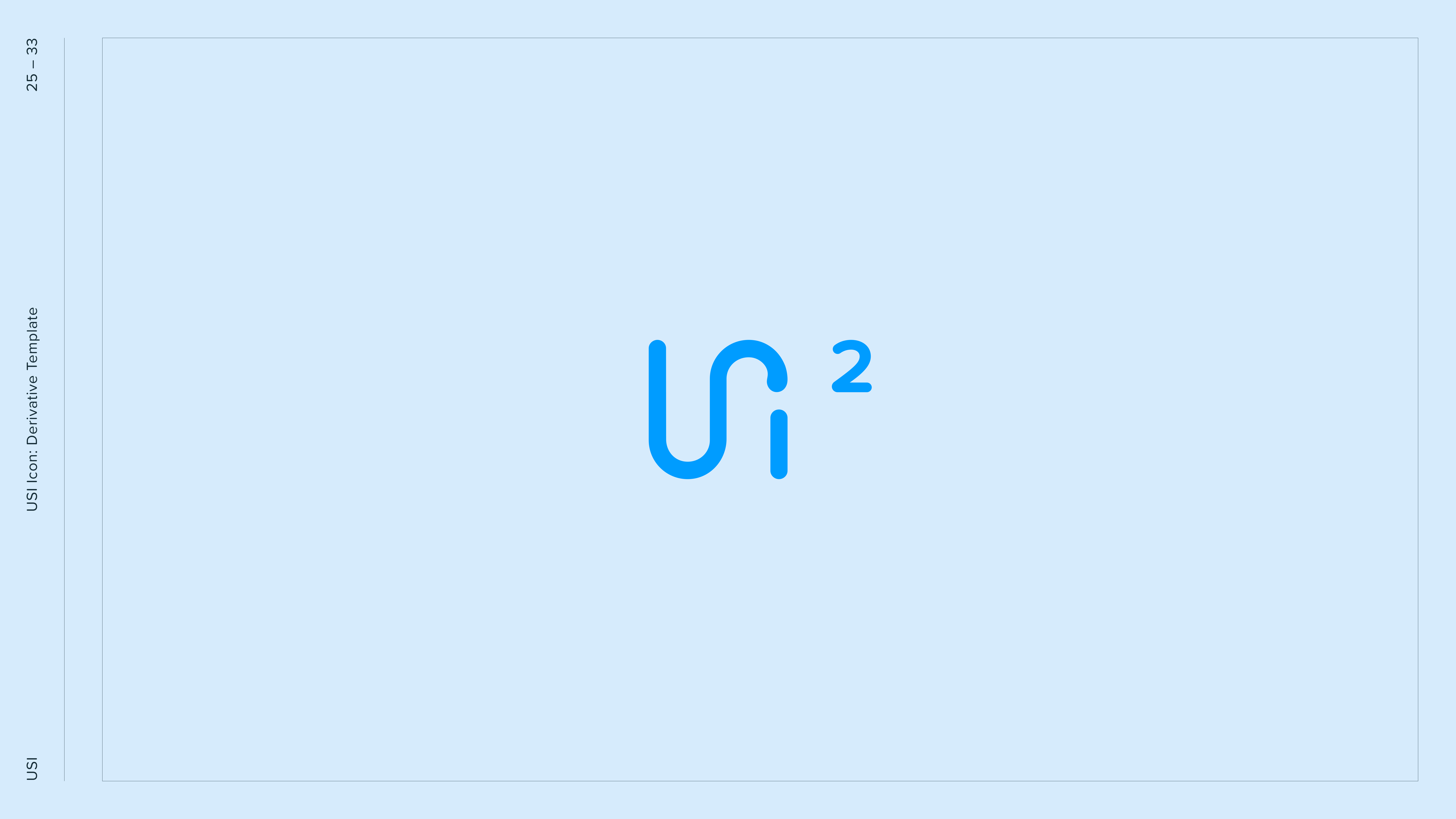
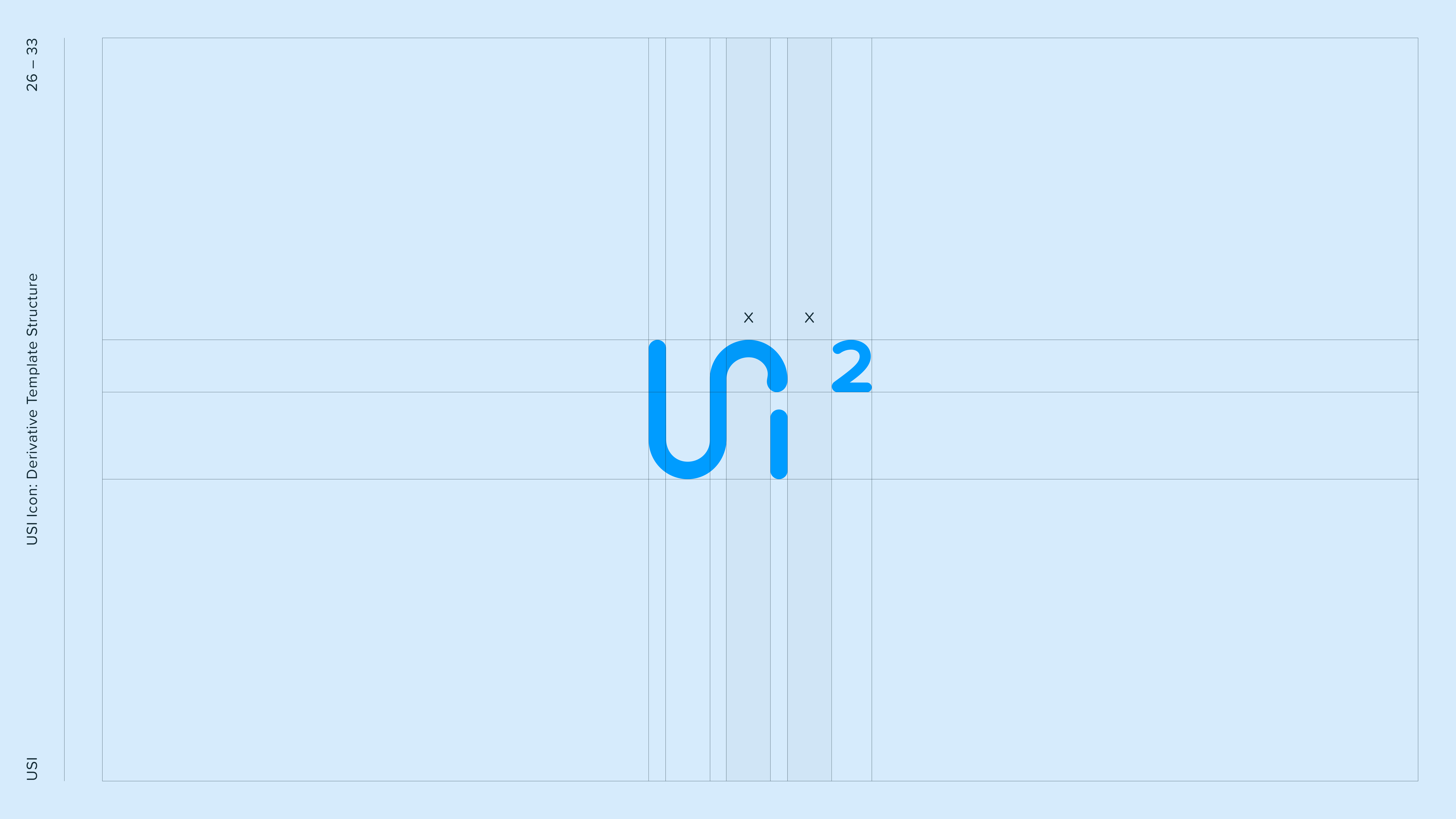
I led the redesign of the USI brand mark, reworking both the icon and wordmark to feel like one system.
My focus was on fluidity, simplicity, and usability, making sure the mark worked in every context, from tiny digital favicons to global partner presentations.
• Brand mark redesigned from the ground up
• Icon and wordmark unified into one system
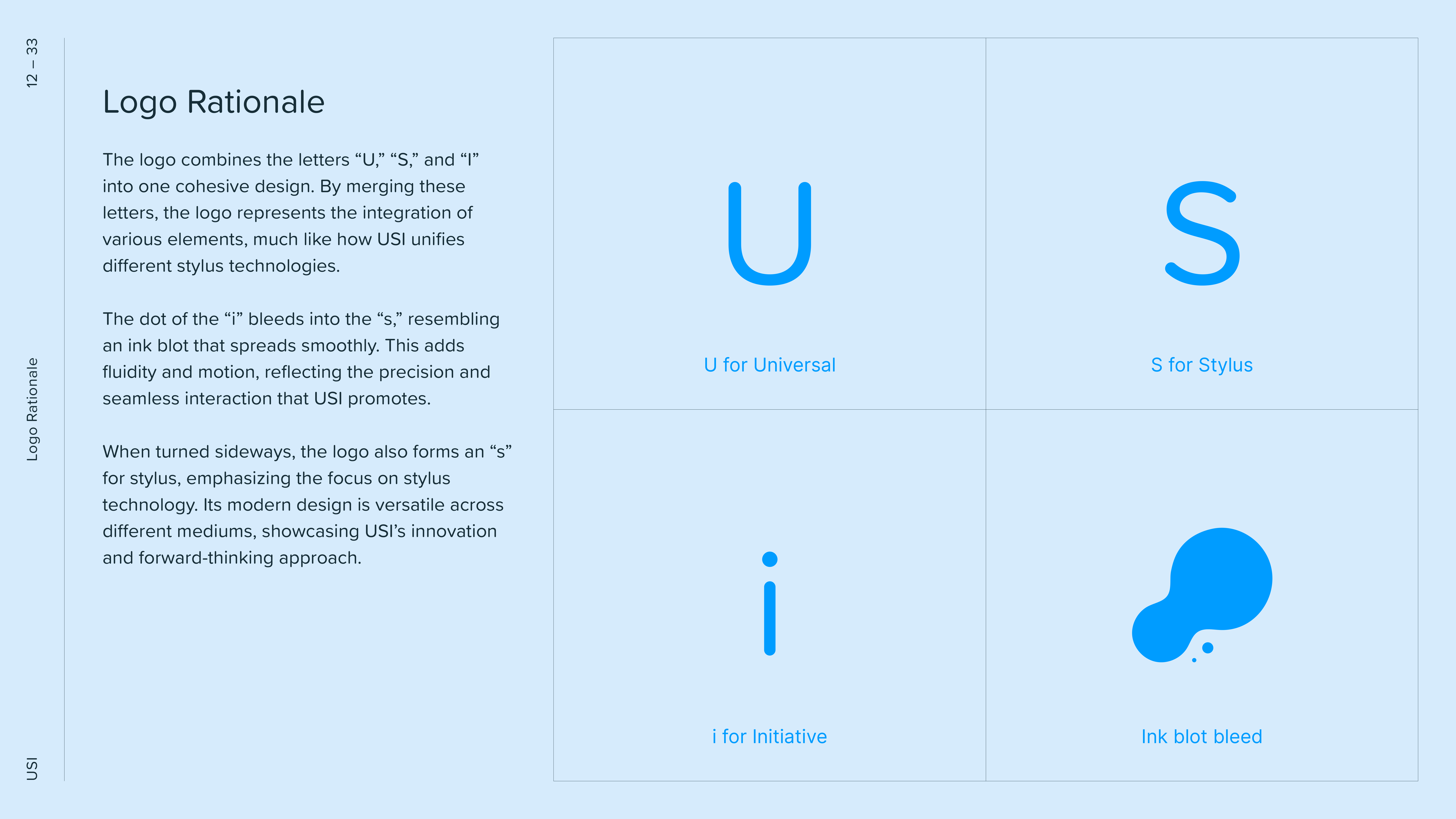
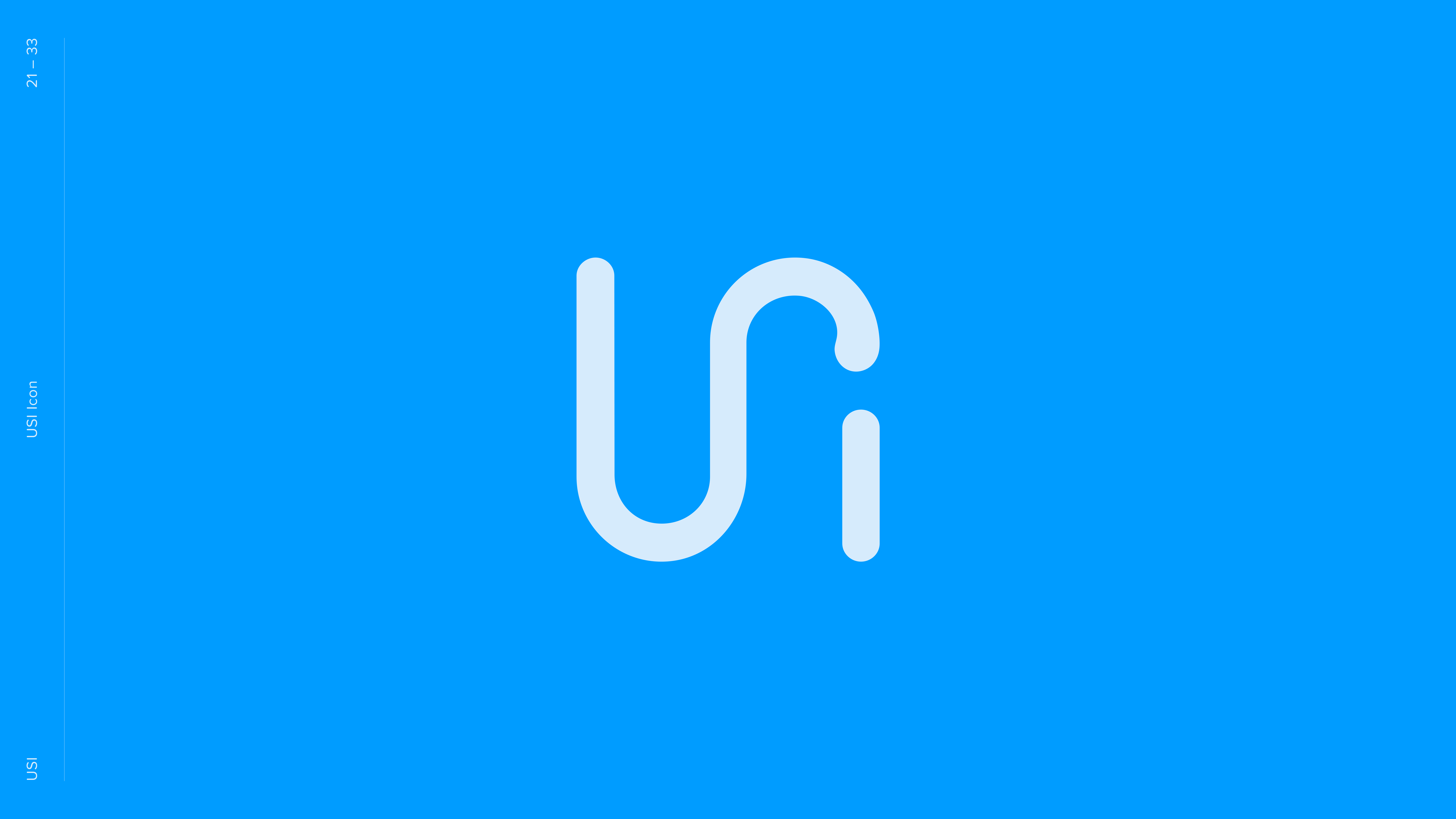
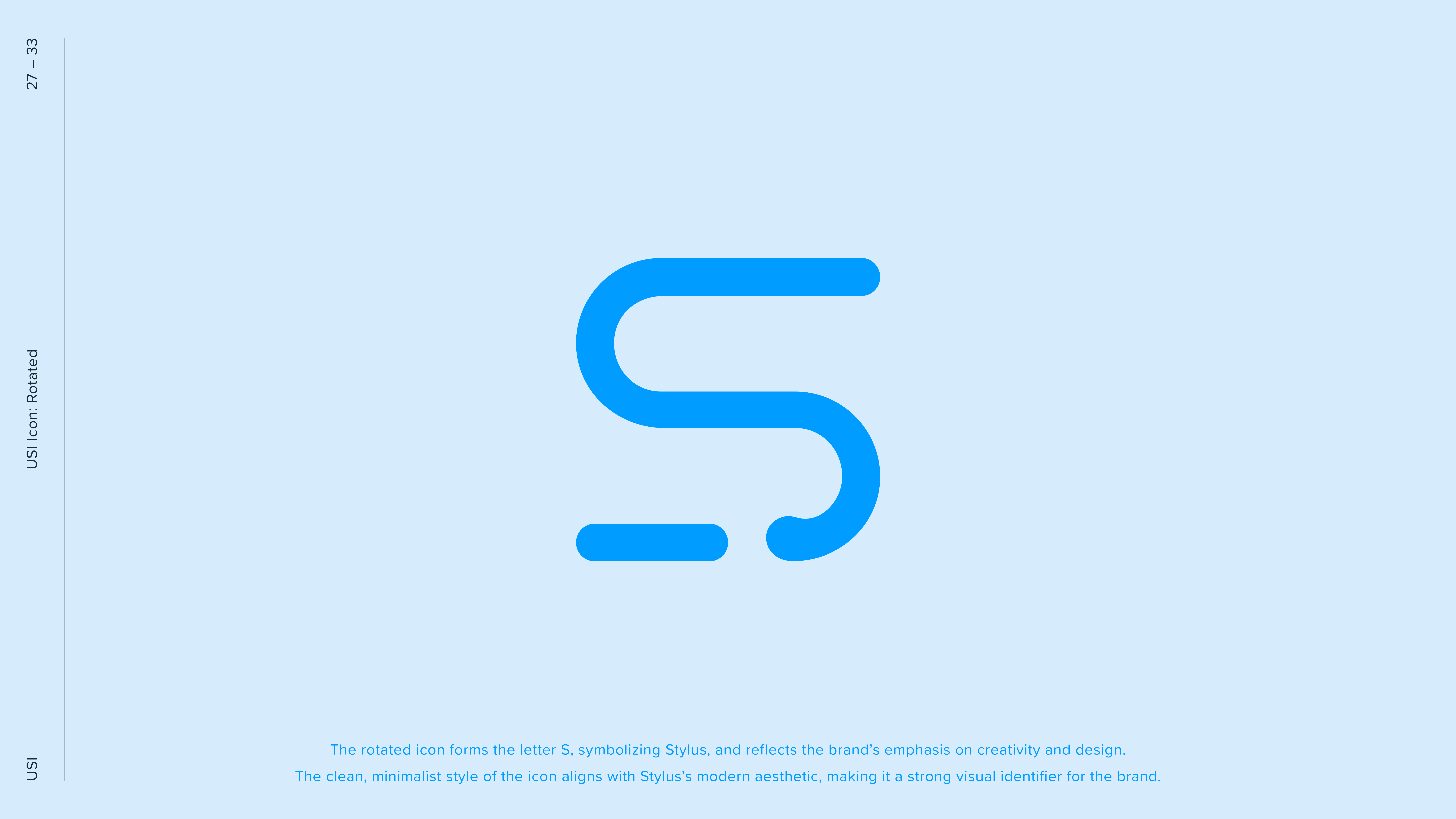
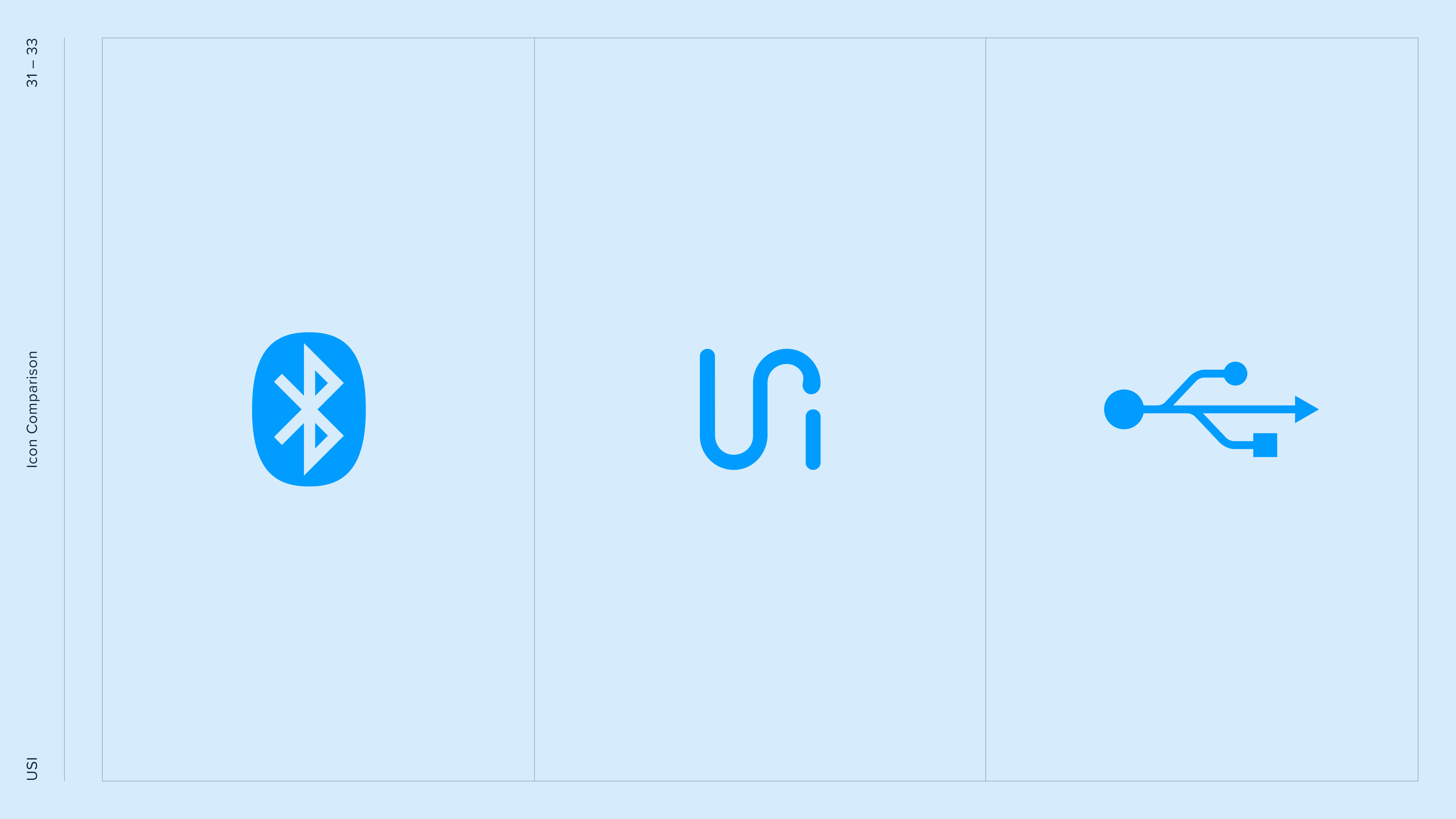
• Fluid form inspired by the “U, S, i” letterforms
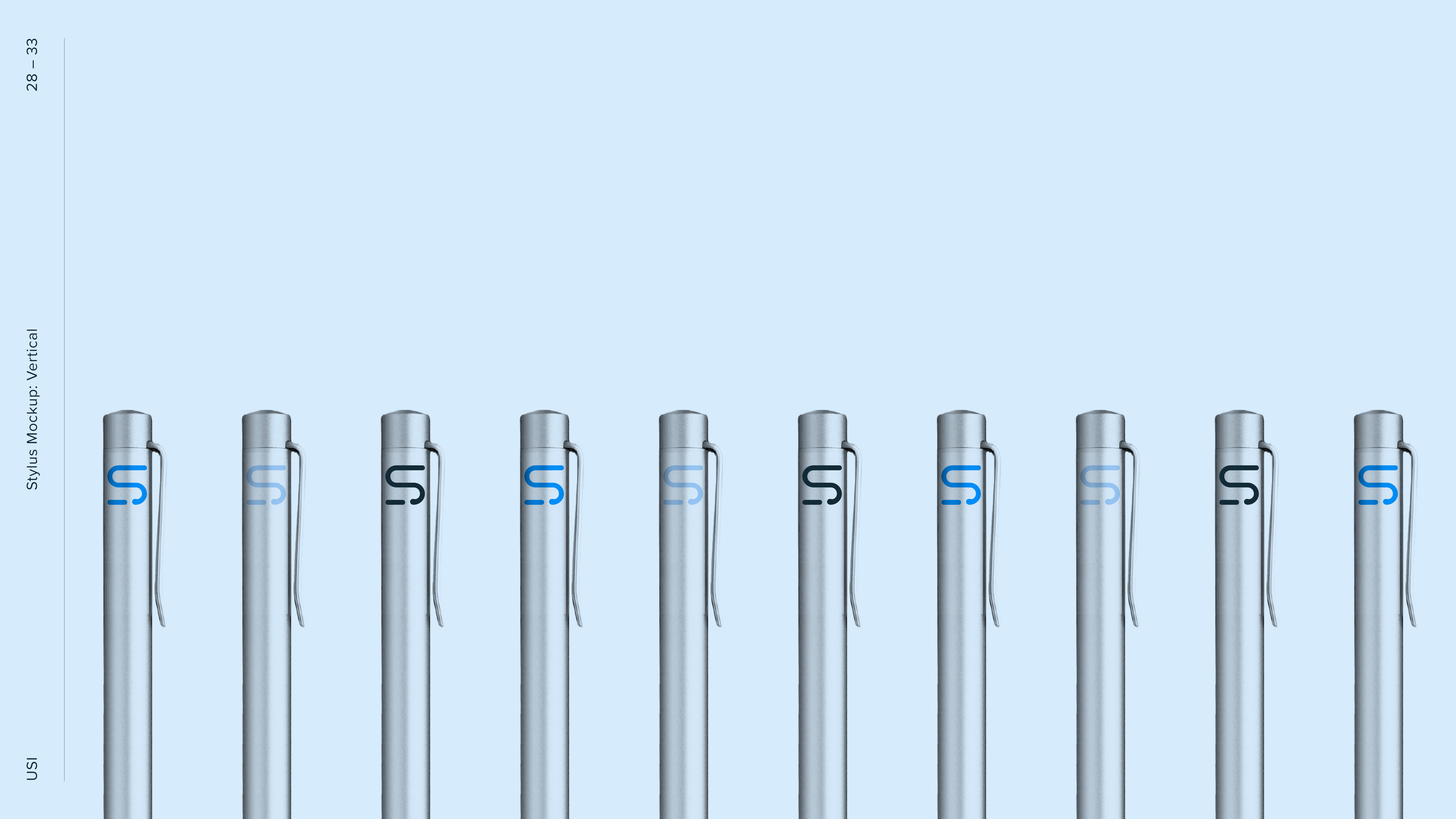
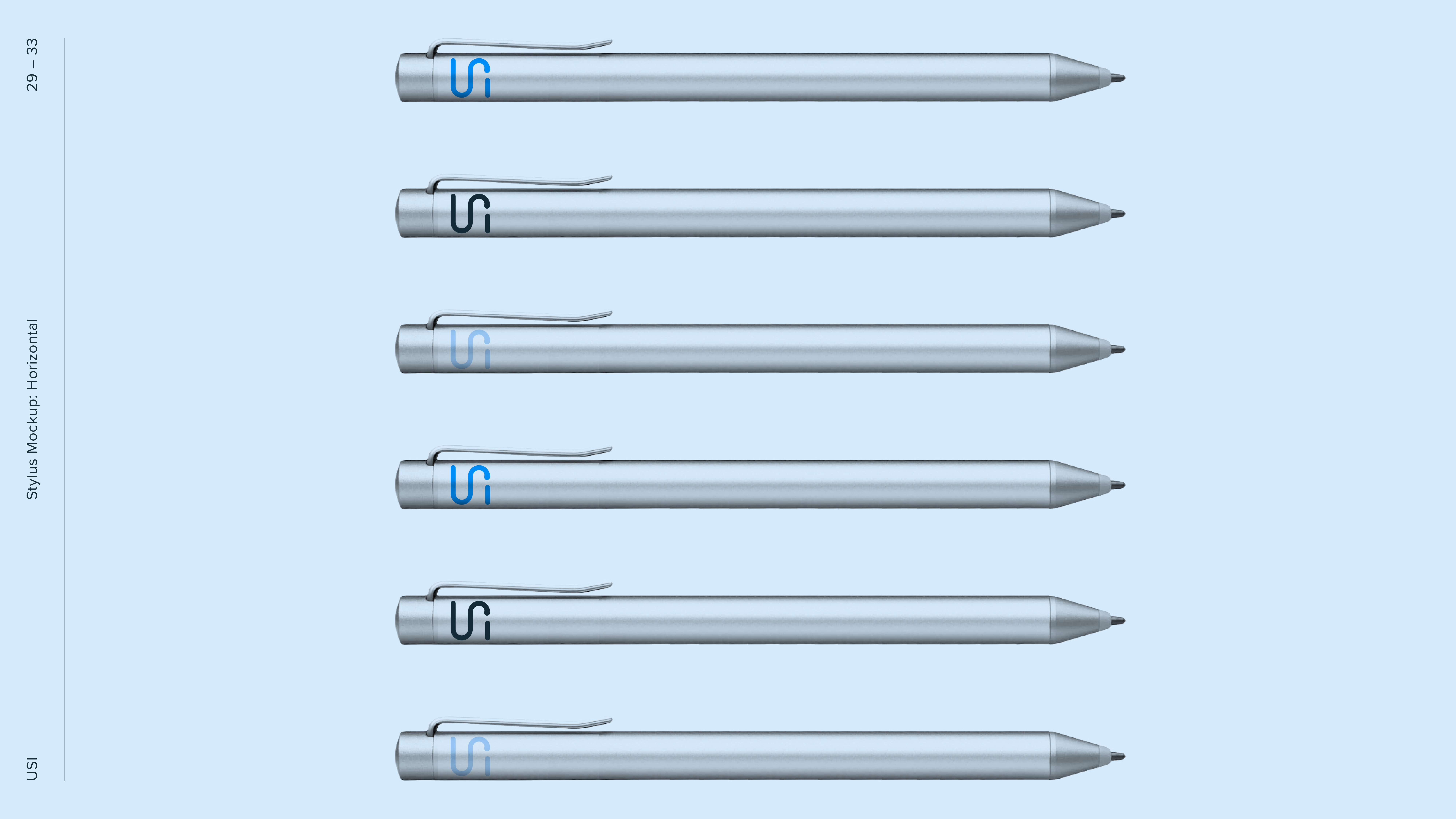
• Designed to work on a stylus in any orientation
• Built for clarity and flexibility across mediums
• Rescued a client relationship on the brink
THE OUTCOME
Simple, fluid, and instantly recognizable. It functions seamlessly across formats and reflects the collaborative spirit of the consortium.
More than a redesign, it turned around a relationship that was nearly cut off and gave the client confidence to move forward with an identity that finally works.










TESTIMONIAL
We just reviewed the final rev. of the updated logo and branding in our Q3 F2F – FANTASTIC outcome from Neil and the team. The logo and branding were well received by everyone. It’s evident that Neil put significant effort into this and took a very thoughtful and thorough approach. Just wanted to share our appreciation. THANK YOU!