THE CHALLENGE
The Third is a beloved neighbourhood restaurant with an established logo and identity. They came to me for a brand refresh that respected their history but elevated their look.
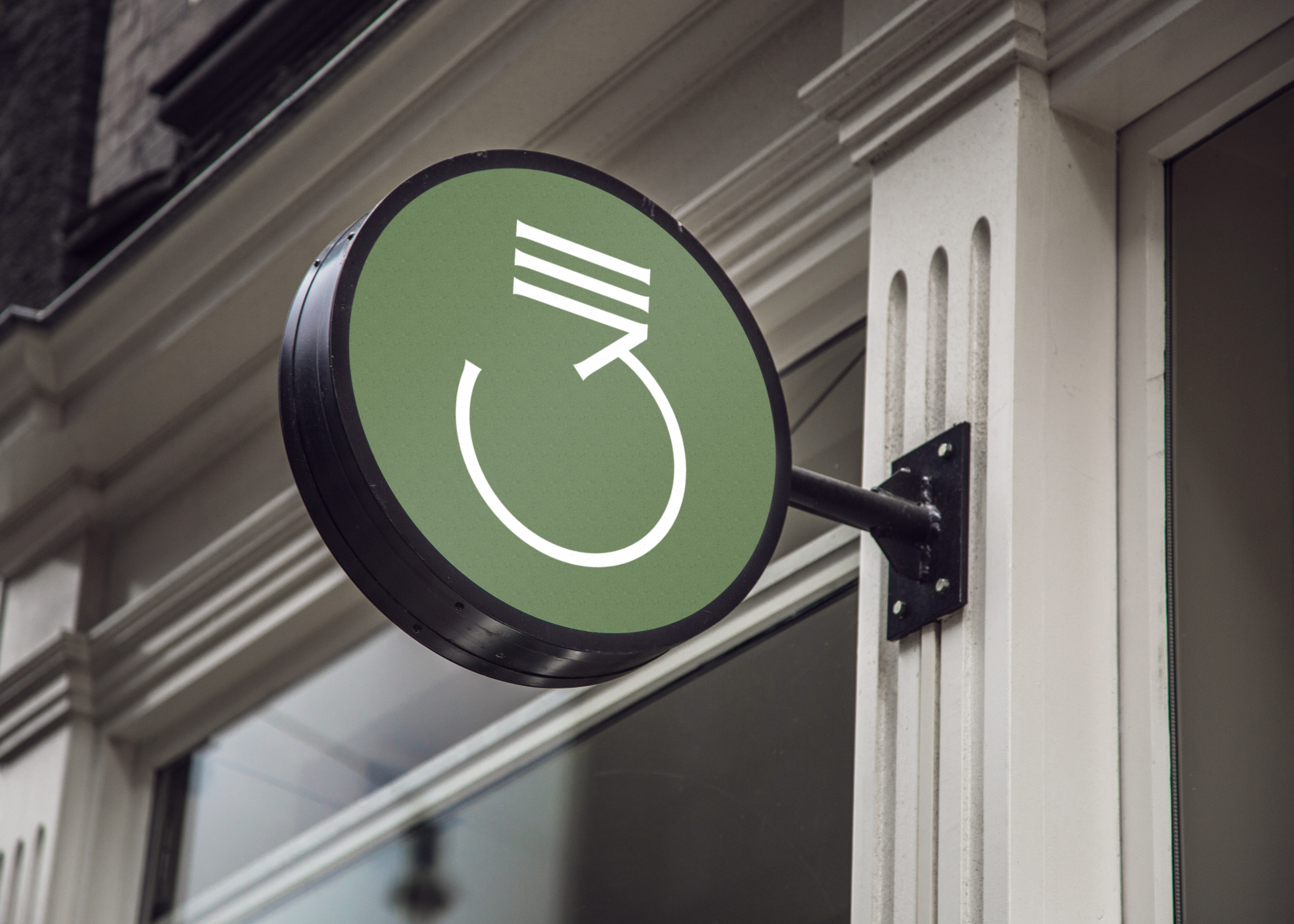
The lightbulb had to stay as the central focus, and the number “3” needed to be worked in without feeling forced. On top of that, the bright green palette no longer fit the restaurant’s classic, moody interior.
MY ROLE
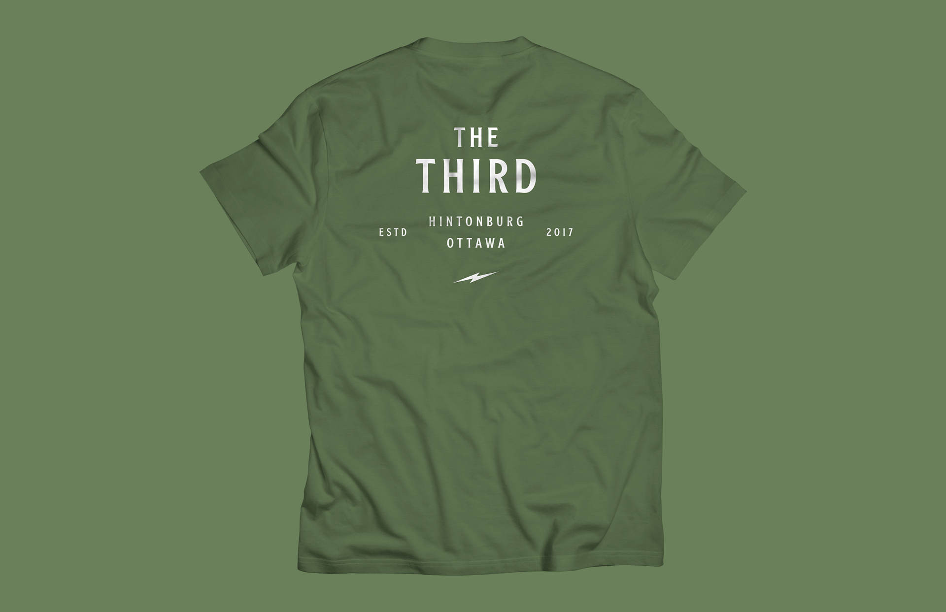
I approached the project as evolution, not revolution, carefully redesigning the logo and menus to feel both familiar and new.
• Logo with filament forming a “3”
• Subtle aha, timeless heritage
• Palette drawn from the restaurant itself
• Menu system redesigned for a cohesive experience
• Identity modernized while staying true to the original
THE OUTCOME
Timeless and clever, the refreshed identity honours the restaurant. The logo has a little moment of delight, the colours reflect the space, and the menus complete the experience.
A brand that is as memorable as the restaurant.