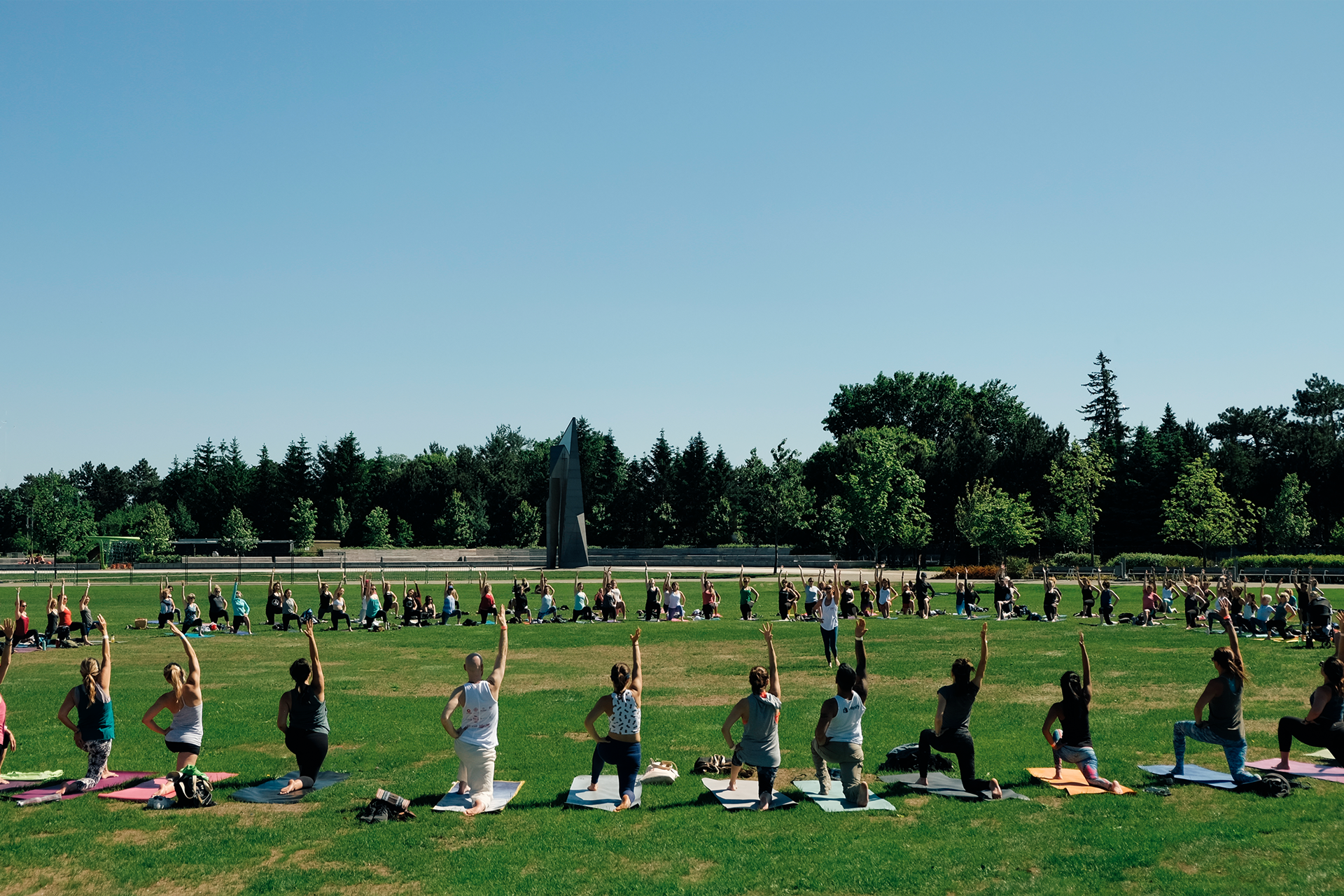
City of Om is an Ottawa-based yoga and wellness festival that was expanding its offerings. The festival needed a new brand identity that could grow with it. The primary goal was to create a brand that felt fun, approachable, and welcoming to everyone from seasoned yogis to curious first-timers. It had to be vibrant and energetic without being intimidating.
As the brand designer, I took a hands-on approach to creating an identity system that was as flexible and welcoming as the festival itself.
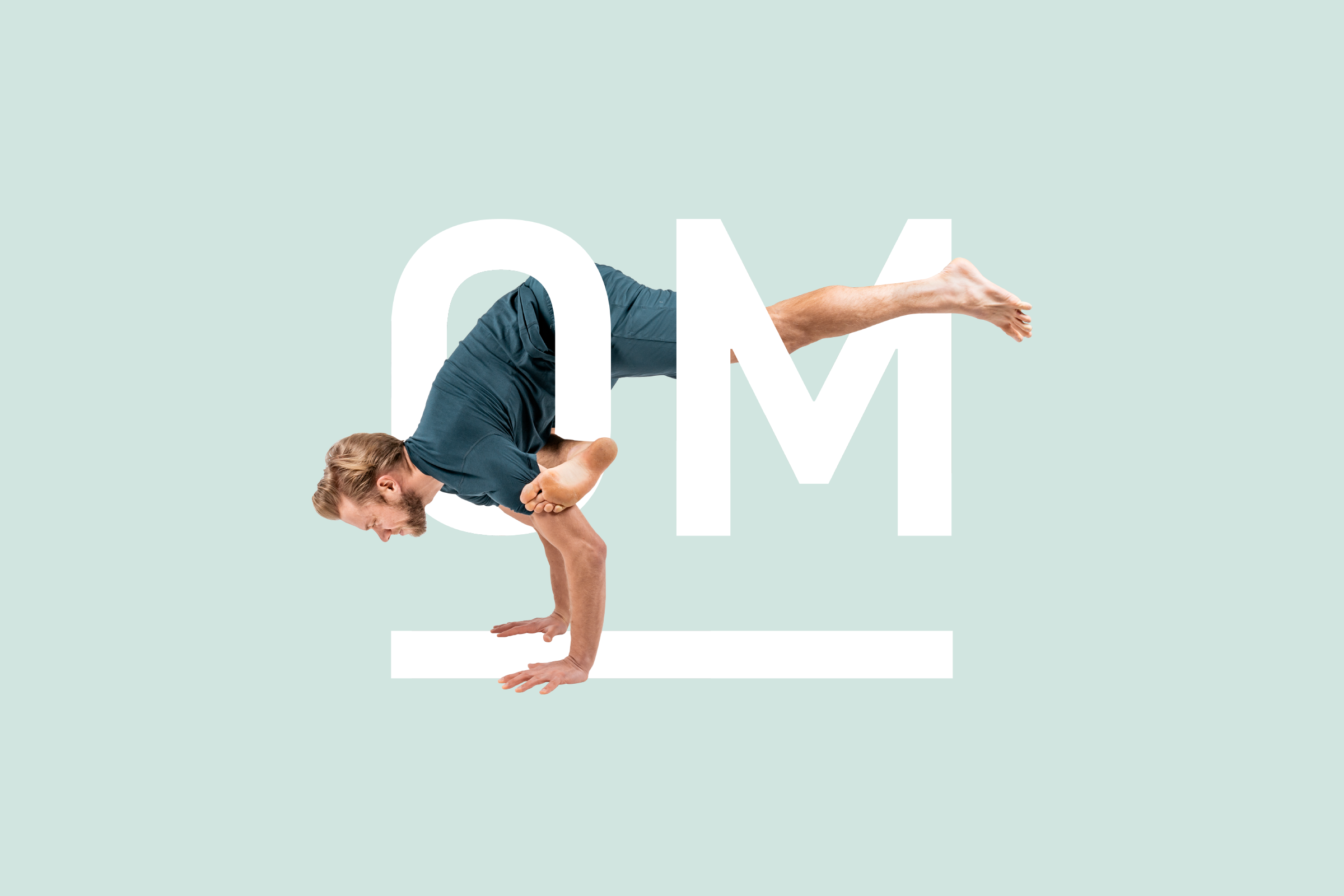
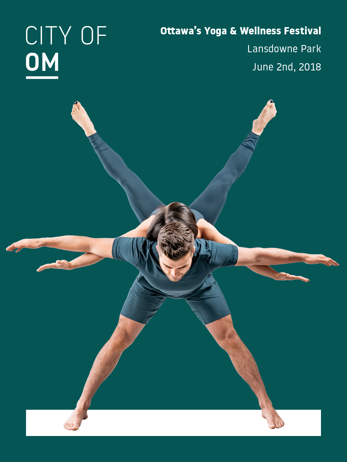
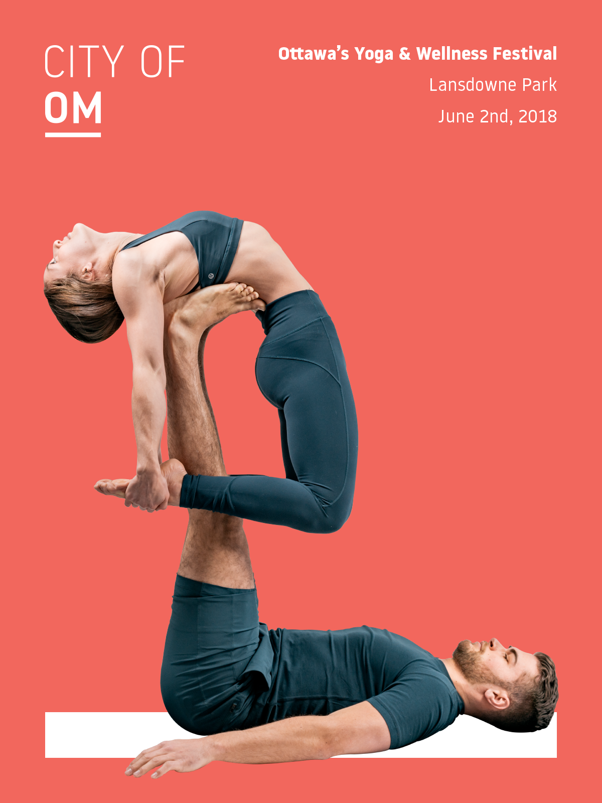
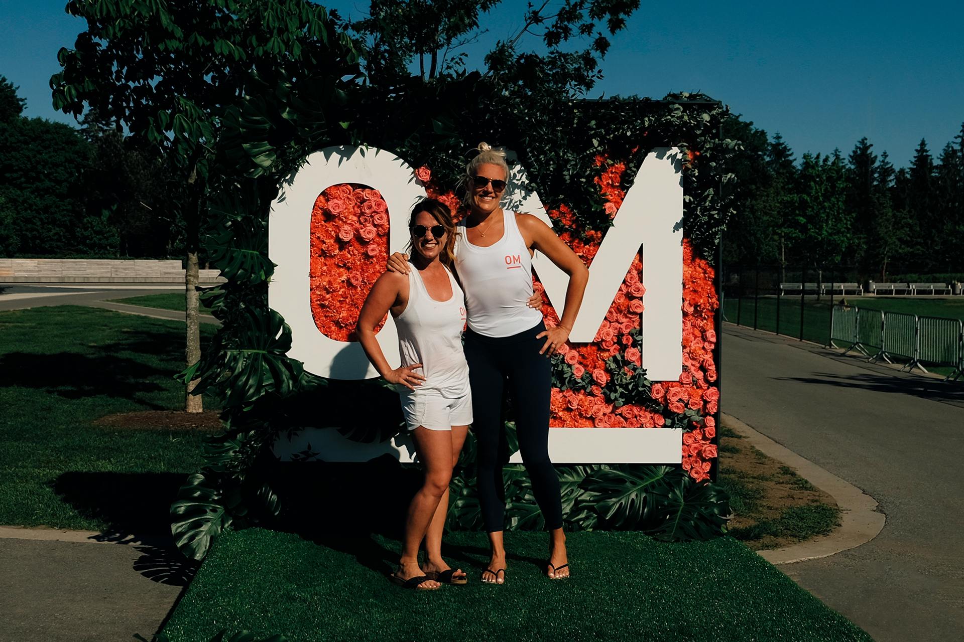
My aim was to create a brand that was bright, bold, and full of life. I developed a logo and visual system that used a playful, modern aesthetic. The custom wordmark is friendly and grounded, reflecting the festival's community-focused vibe.
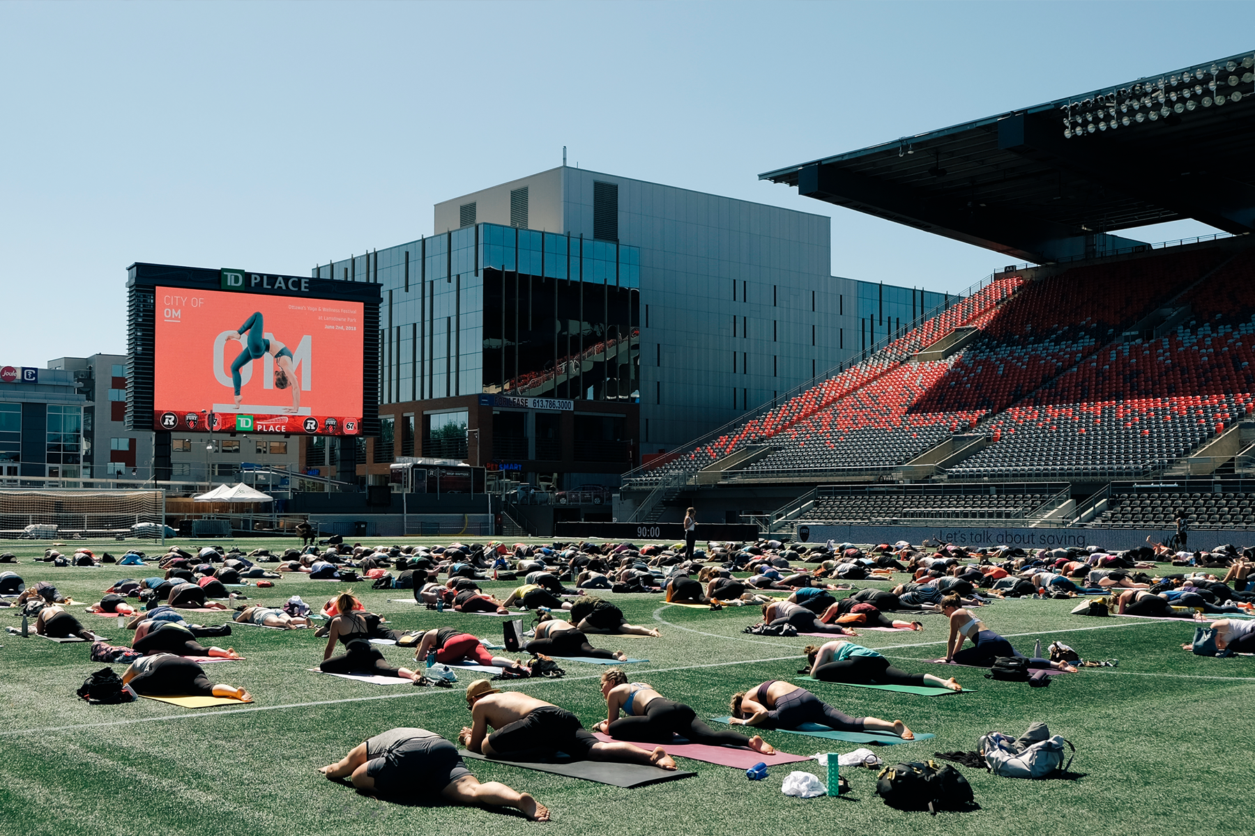
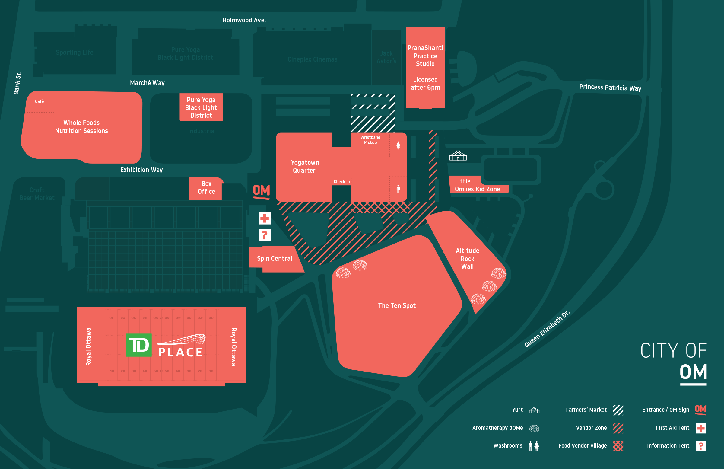
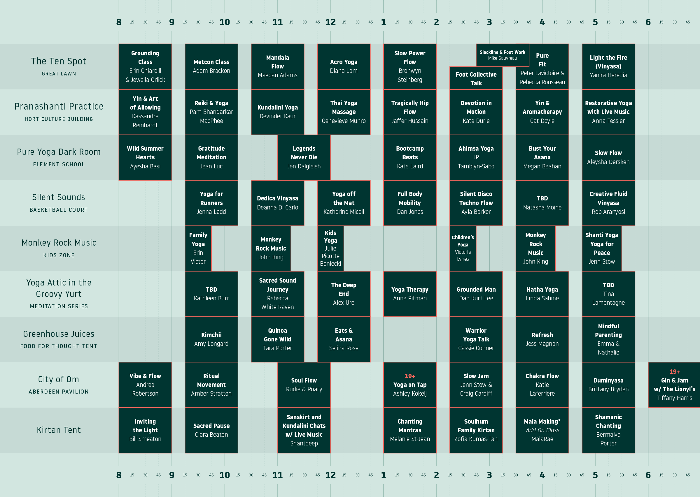
The brand was designed as a toolkit. I created a system of colours, patterns, and icons that could be used across all festival materials from social media and wayfinding signage to merchandise like yoga mats and apparel. This system ensured everything felt connected while allowing for creative variety.
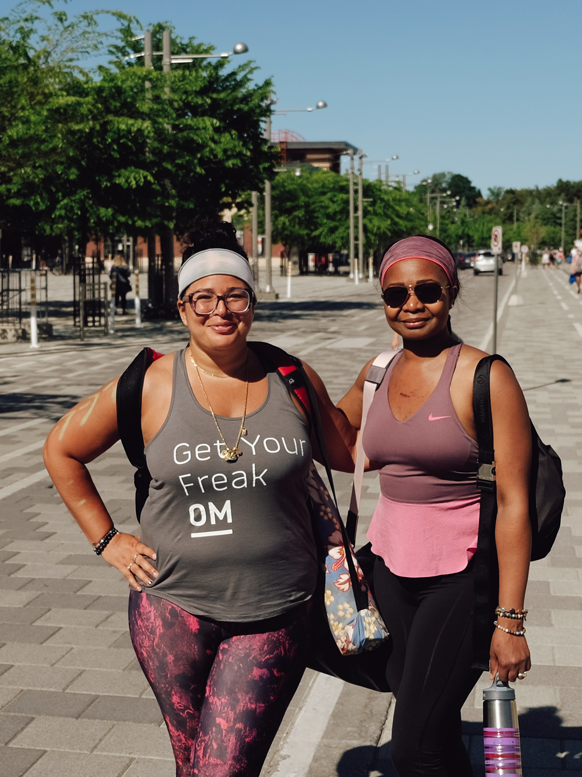
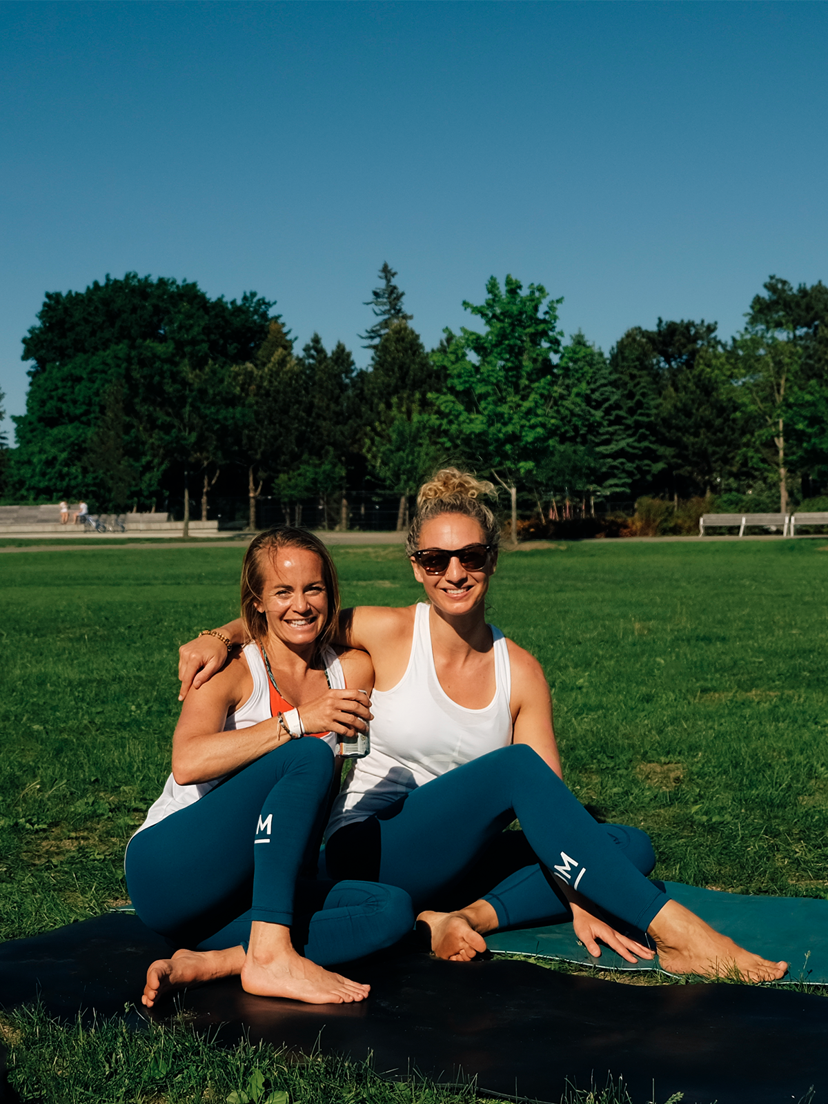
I designed a wide range of applications for the brand, showing how it could come to life in the real world. The designs for t-shirts, yoga mats, and other merchandise were created to be things people would genuinely want to use and wear, turning attendees into brand ambassadors.
The new branding gave City of Om a vibrant and cohesive identity that perfectly matched its community-oriented mission. The flexible and approachable system provided them with the tools they needed to successfully market the festival, attract a diverse audience, and create a memorable and welcoming experience for all attendees.
"Thanks for all the hard work. Fabulous job."